
🌍
English
Announcement
- [2024-04-17] Piwigo 14.4.0
- [2024-04-01] Piwigo in Hobbit runes
- [2024-03-01] Piwigo 14.3.0
- [2024-01-30] Piwigo 14.2.0
- [2023-12-29] Piwigo 14.1.0
#1 2023-06-29 21:43:58
- windracer

- Member
- St. Pete, FL
- 2014-12-28
- 458
Modus: line breaks before/after hyperlinks?
I'm new to Modus (playing around with it due to the revised search features in the v14 beta) so apologies if this has been brought up before (my searching wasn't finding anything I deemed relevant).
On a mobile device, it looks like hyperlinks are separated by line breaks before and after the link. For example, on my v14 beta site, I have some text in the header and footer. Notice how on the desktop it's all one line, but on mobile it "breaks" on each hyperlink: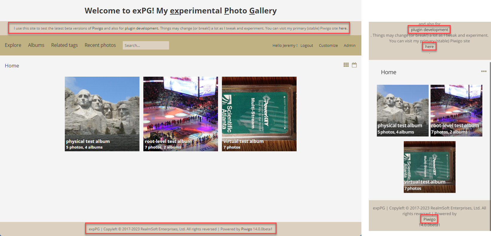
This isn't specific to v14. On my primary (v13.7.0), the same thing happens. Notice how the albums dont break, but each individual thumbnail does: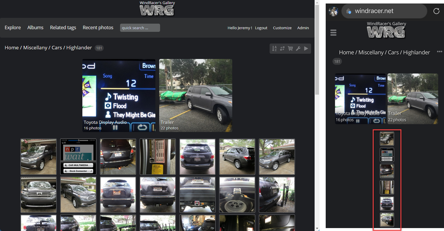
And again the footer: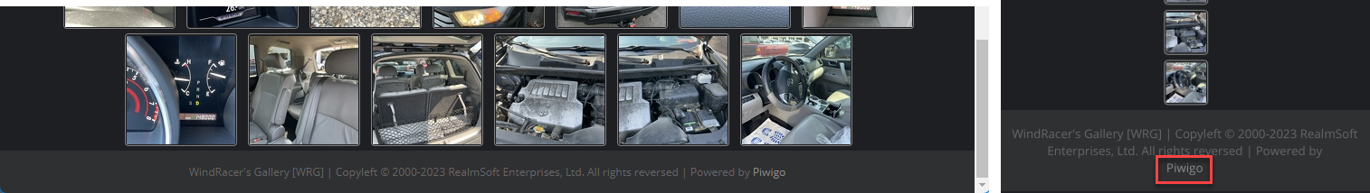
Is it expected?
If on the mobile site I change the photo size from "square" to "thumbnail" they all properly tile, but the breaks in the header/footer are still there, so maybe those are two separate issues.
edit: hmmm, ok, it's something with the screen size. Not sure why I didn't test this before posting but if I rotate my phone into landscape mode, there are no breaks around the hyperlinks and the text (and square thumbnails) wraps as I would expect. Guess it's a CSS formatting thing.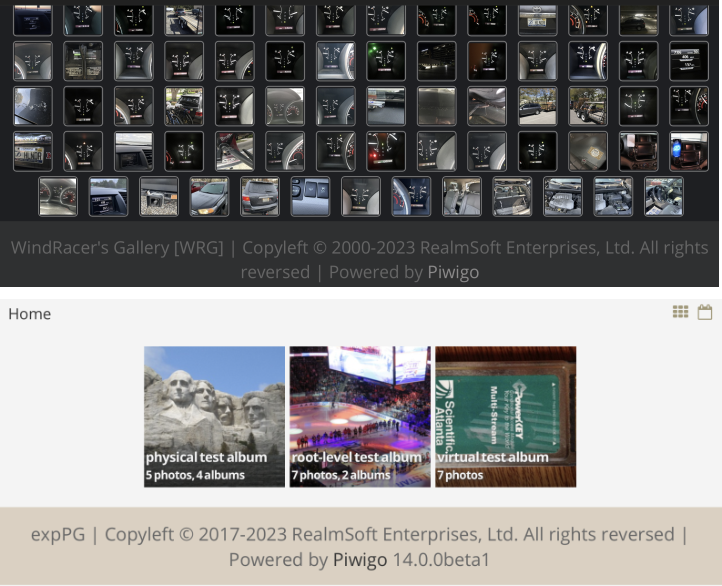
Last edited by windracer (2023-06-29 21:52:45)
Offline